According to my user research, Apple's Contacts app does not meet users' daily needs in contacting people due to the lack of accessibility to frequent connections.
Constraints
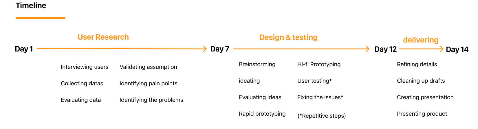
At the beginning of the project, I acknowledged 2 major constraints:
Limited timeline, 2 weeks. Within a short time and a large number of tasks, I had to create an effective schedule and prioritize tasks to ensure the deadline is met.
I was the only UX designer and UX researcher. Although being a sole designer allowed me to make my own decisions, working in a team would be more valuable to collect more data and diversify ideas.
2. Research
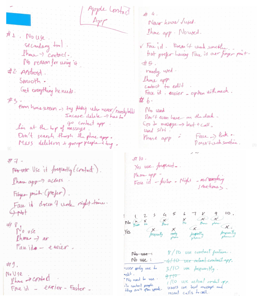
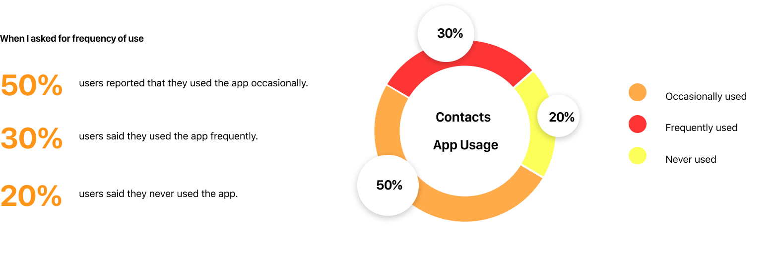
I started off with collecting qualitative and quantitative data by interviewing 10 iOS users, ages 18 to 25, and observing they performing tasks to identify the pain points.
My research revealed that the Contacts app is a secondary tool for finding someone. Notably, users only used the app to edit and find rarely-contacted people. Based on the collected data, most users prefer Phone apps and other social apps, such as Facebook Messenger, Instagram, and Snapchat, to contact their frequent connections. Besides, many users reported they had never used the Contacts app, and others didn’t even know it existed.
Therefore, I hypothesized that the Contacts app doesn’t meet users’ daily needs of contacting people due to the lack of accessibility to frequent contacts.
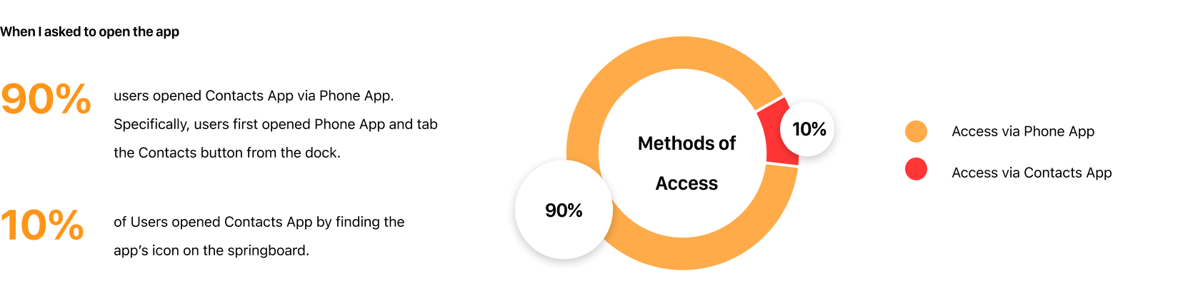
Statistic on 10 users
According to the collected data, I have found the frequency of use and how users access the Contacts App.
In addition, many users tend to open other social apps such as Facebook Messenger, Instagram, and Snapchat when I ask to find someone to call.
Fieldnote
Insights
1. Contacts App isn’t very popular among young users.
2. Users only used the app to edit and find rarely contacted people.
3. The app was originally full of text and outdated, compared to other apps such as Viber, Facebook Messenger, and Instagram's follower list.
3. Brainstorming & Ideation
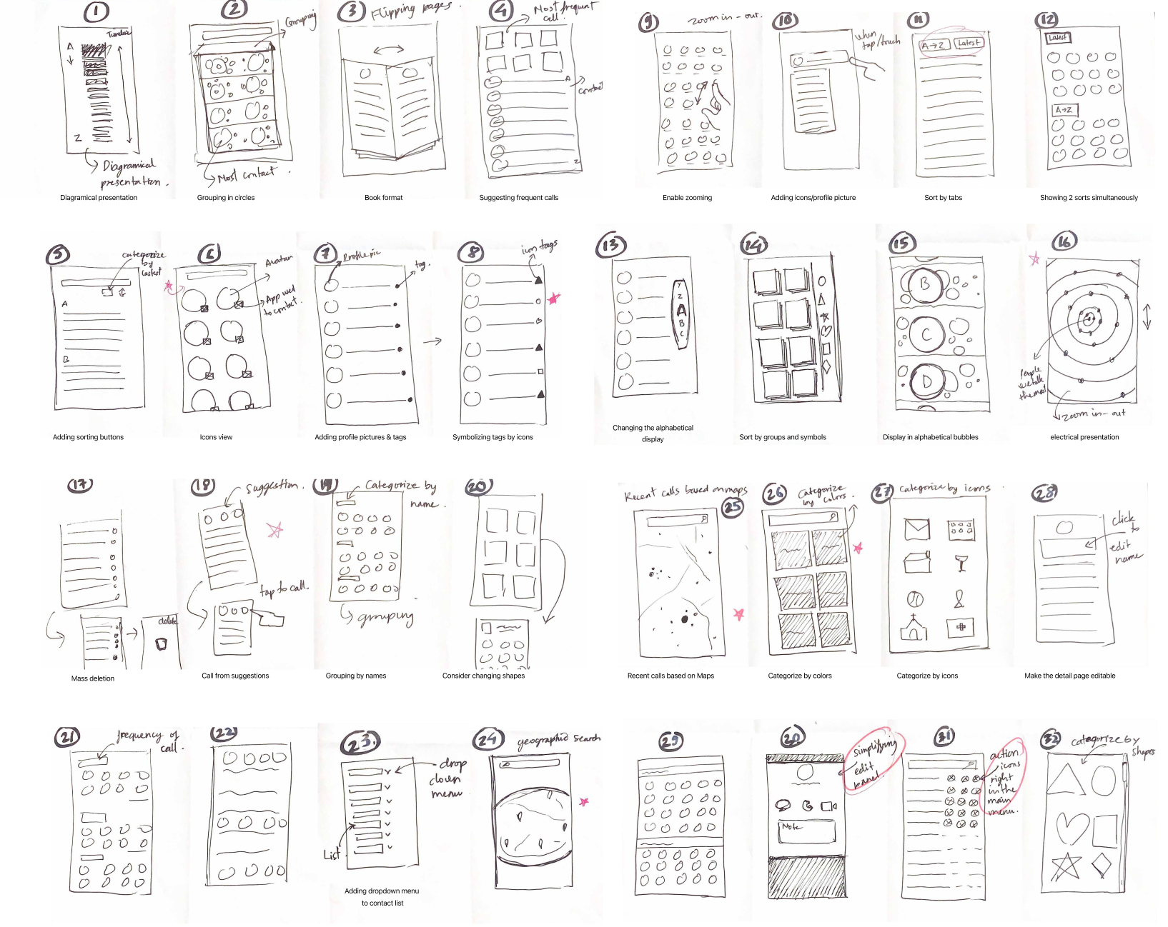
<span data-metadata="" style="caret-color: rgb(0, 0, 0); color: rgb(0, 0, 0); white-space: normal; text-size-adjust: auto;"><span data-buffer="" style="caret-color: rgb(0, 0, 0); color: rgb(0, 0, 0); white-space: normal; text-size-adjust: auto;">I began the brainstorming session by generating 32 different ideas with Crazy 8's method.
Crazy 8’s method enabled me to explore many sets of ideas in a very short time. During this phase, I brainstorm to explore many possibilities to improve the Contacts App in terms of usability and visuals. I only allow myself to spend 30 seconds on each idea and move on to the next when the time is up. Therefore, this process forces my brain to think iteratively to capture many ideas that come to mind.
Crazy 8’s panels
Evaluating ideas
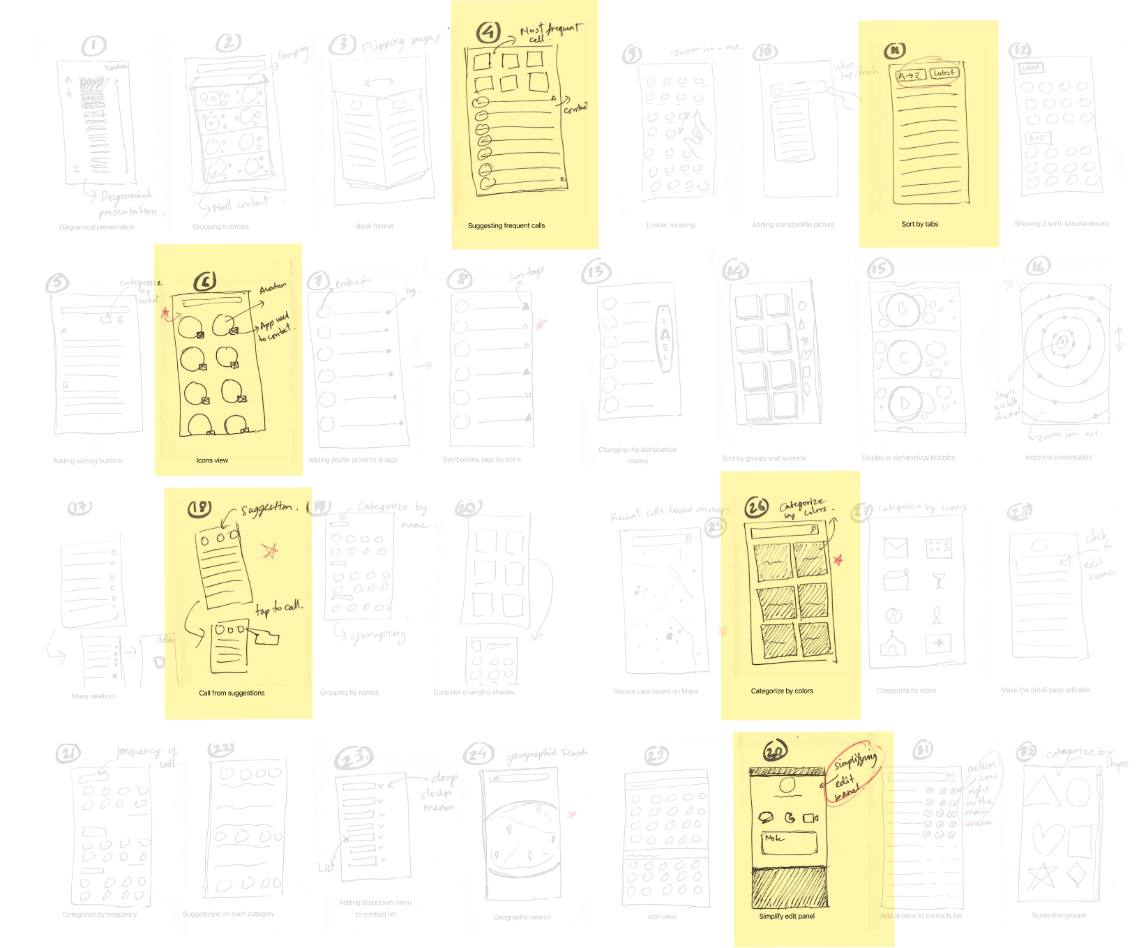
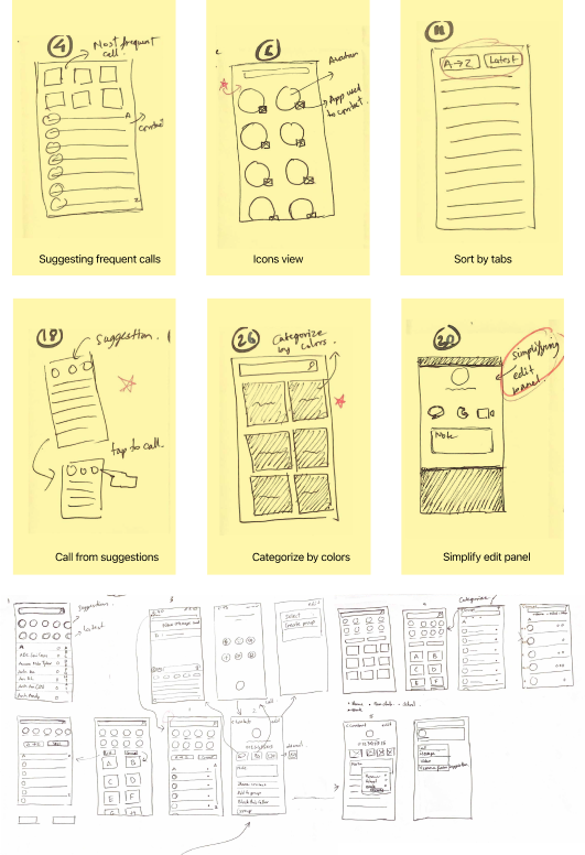
After evaluating the ideas, I chose 6 options that I considered successful for the next round of iteration.
The 6 successful panels contain the features that I believe would be useful and feasible.
Suggesting frequent contacts makes the Contacts App more convenient for users to find people they usually talk to.
Icon view enhances the app’s interface and helps users quickly identify contacts.
Sort by tabs allow users to switch between list view and group views.
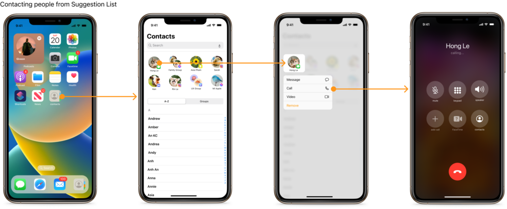
Making a call from suggestions allows users to achieve the task without going to the contact detail page.
Categorizing by colors allows users to customize their Contacts.
Simplifying the contact detail screen is necessary because it contains a few duplicated features within the same page.
After considering the idea list, I moved forward with the Suggestion List and Sort ByTab. Then, I took the next step creating a low-fidelity with a high-resolution prototype to proceed with my first user testing.
Also, I participated in critiques with peers to review my paper prototype, took notes on their feedback, and provided feedback on theirs.
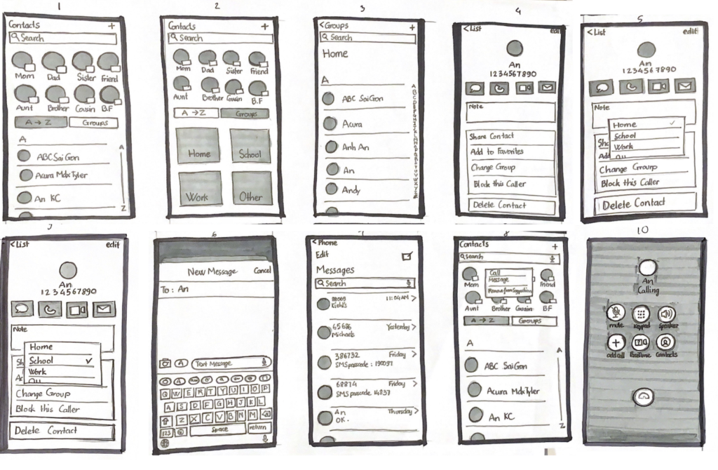
Low-fi high-res Prototype
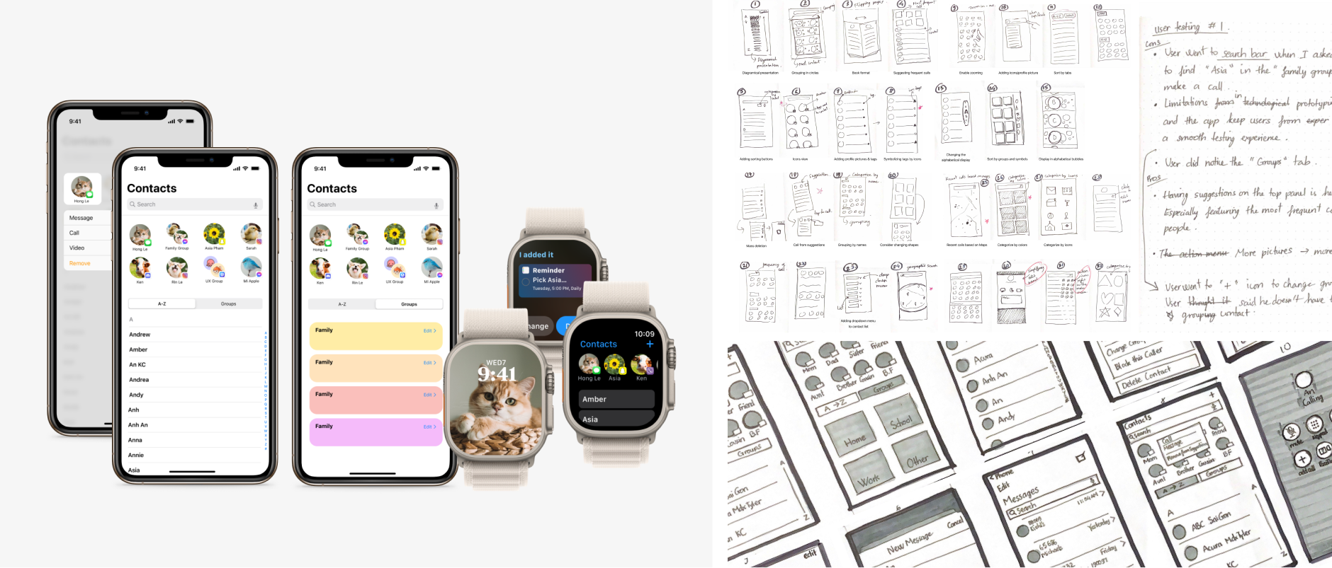
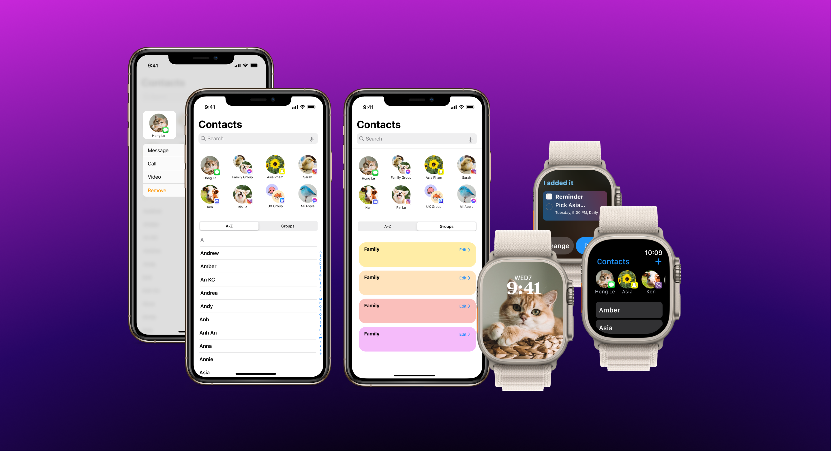
4. Suggestion List & Group View
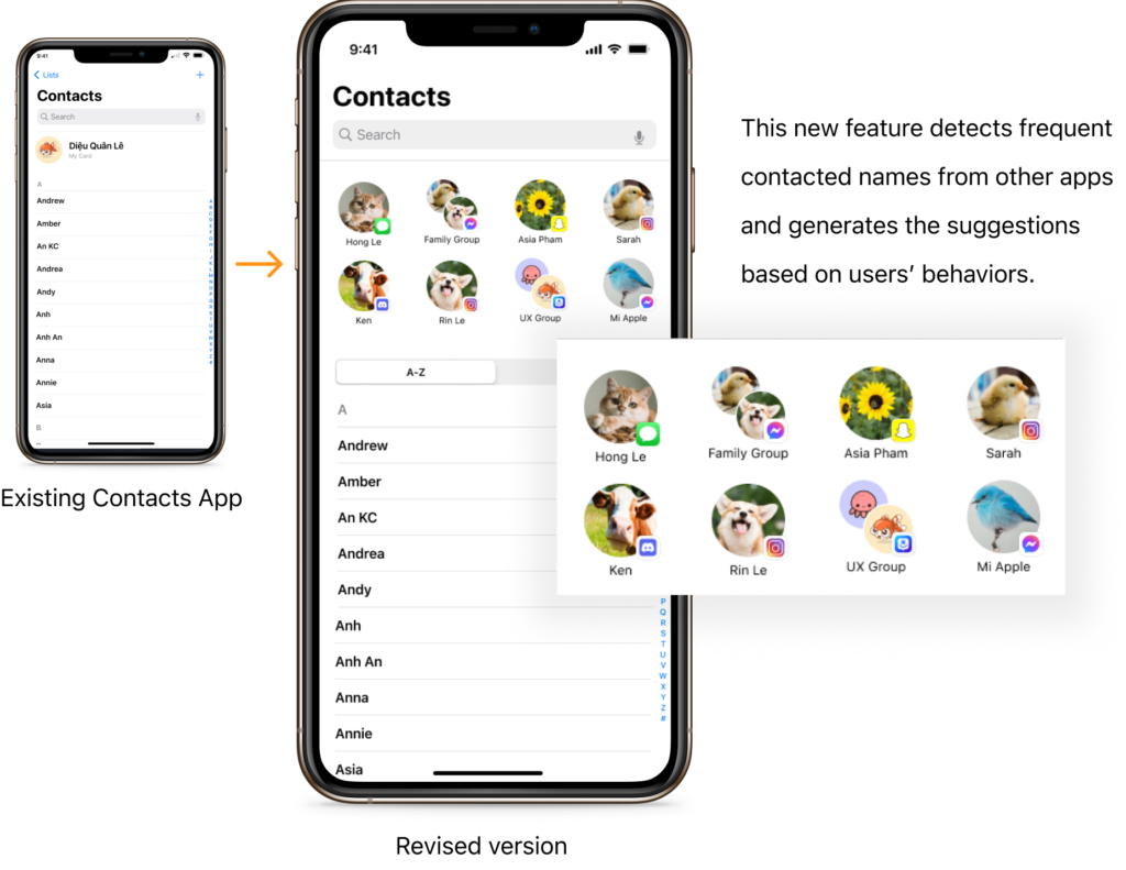
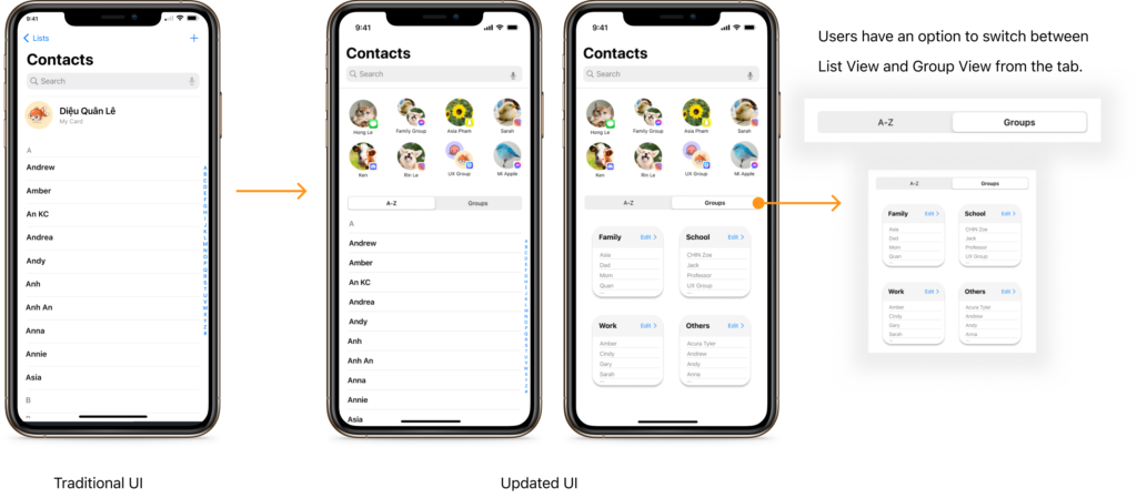
According to the interviews, users didn’t find reasons to use the Contacts app because they contact people via other apps, such as Facebook Messenger, Viber, Snapchat, Instagram, etc. In addition, users only use the app to edit and find the ones they rarely contact. As a result, the app became the least priority in their communication. Therefore, I added a suggestion feature to the contact app to help users quickly find the most contacted people without going to multiple apps. Thus, it makes the app more helpful and friendly to users regarding visuals and functionality.
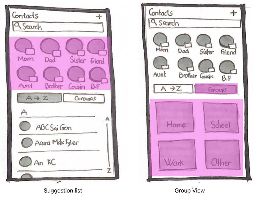
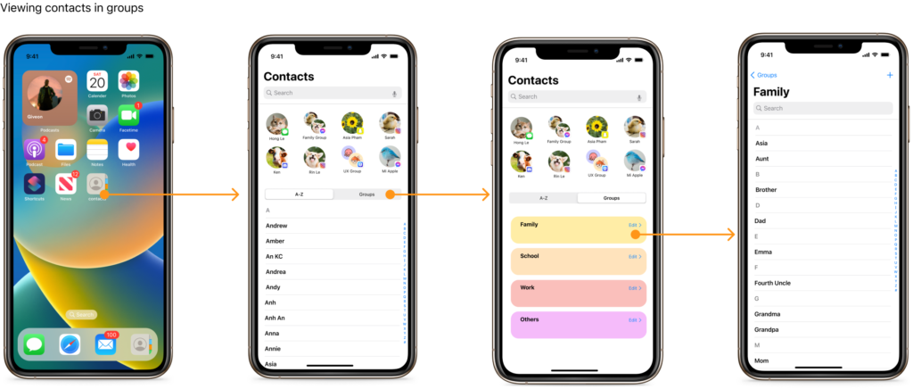
I designed a suggestion feature on the top of the main screen that consists of all frequently contacted people from other social apps on iOS. Also, I add a group view that allows users to sort contacts into different groups. For sample, family, school, works, and so on. So, users can choose between a list view and a group view within a touch.
Hi-Fi Prototype of Suggestion List
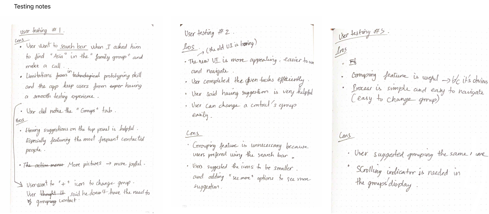
In user testing, users reported that having suggestions on the top screen is helpful, especially since they featured the most frequent contacts. Also, users provided positive feedback about the Suggestions because they added more visuals to the app, making it more delightful and appealing.
Users can now use the Contacts App to find people they rarely talk to or frequently contact. Also, users don’t have to go to multiple apps to find people because the Contacts App now has everything updated.
Hi-Fi Prototype of Group View
The grouping feature allows users to categorize contacts into groups. For sample, family, school, works, and so on. So, users can choose between a list view and a group view within a touch.
5. User Testing
Users reported that having suggestions on the top screen is helpful because they featured the most frequent contacts.
Users reported that having suggestions on the top screen is helpful, especially since they featured the most frequent contacts. Also, users provided positive feedback about the suggestions because they added more visuals to the app, making it more delightful and appealing.
Although I received positive feedback on the suggestion feature, the grouping feature didn’t gain much attention. Users reported:
It’s not necessary to group contacts.
The “Groups” tab is unnoticeable on the screen.
A user didn’t feel confident touching a group because he thought it would make a call to the whole group.
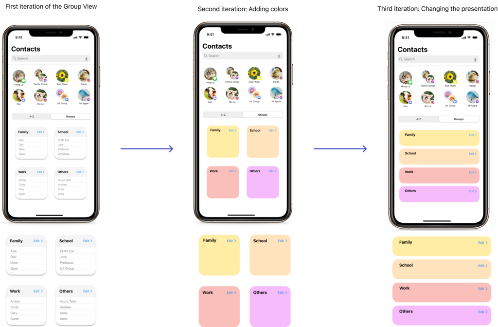
Acknowledging the failure of the Group View, I redesigned its presentation to make the UI more appealing.
Scenarios of use
6. Apple Watch Adaptation
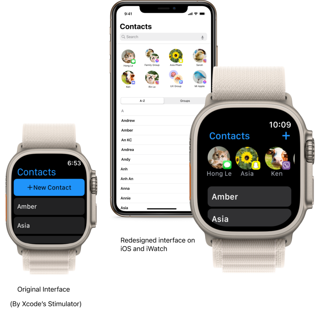
<span data-metadata="" style="caret-color: rgb(0, 0, 0); color: rgb(0, 0, 0); white-space: normal; text-size-adjust: auto;"><span data-buffer="" style="caret-color: rgb(0, 0, 0); color: rgb(0, 0, 0); white-space: normal; text-size-adjust: auto;">To optimize synchronization across iOS system, I redesigned the Apple Watch’s Contacts App interface to match the new features.
Due to the compact size of the watch, I removed the group view and retained the Suggestion List.
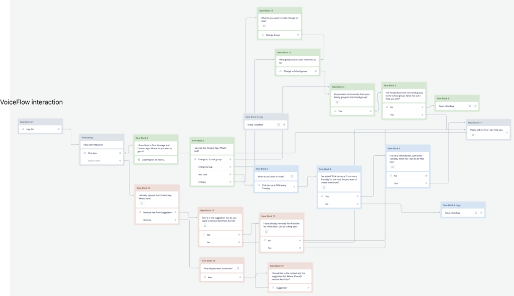
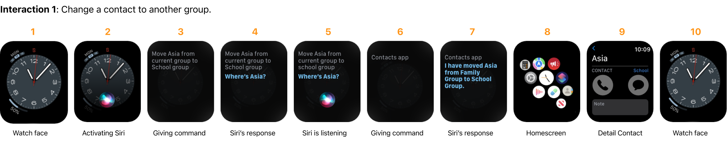
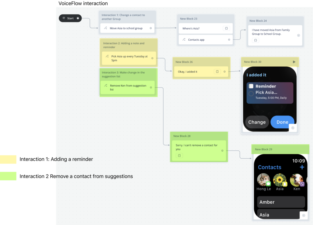
Based on the newly designed feature, I created a voice interface on iWatch to enable possible interactions between users and the Contacts App.
Possible scenarios of use of VUI on iWatch
After reviewing my voice flow with peers, I shortened its conversational structure to simplify the interaction.
Also, I removed unnecessary elements and kept the most viable ones to add to my VUI Design.
<span data-metadata="" style="caret-color: rgb(0, 0, 0); color: rgb(0, 0, 0); white-space: normal; text-size-adjust: auto;"><span data-buffer="" style="caret-color: rgb(0, 0, 0); color: rgb(0, 0, 0); white-space: normal; text-size-adjust: auto;">After reevaluating different sets of interactions, I narrowed down their structure to make the conversations more feasible
High-fidelity High-resolution Prototype
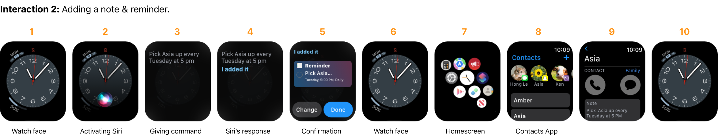
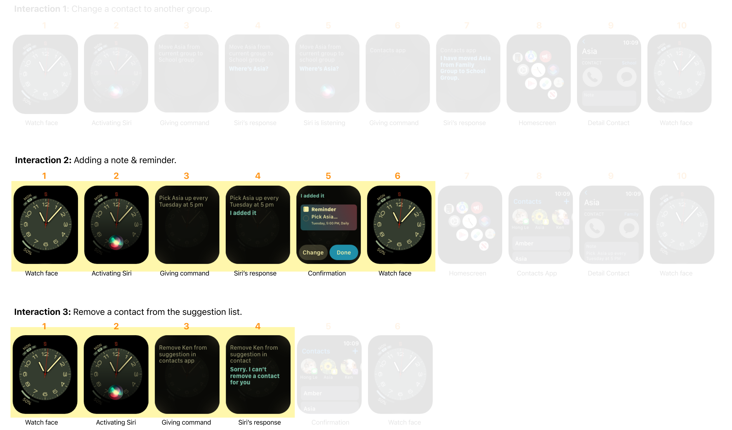
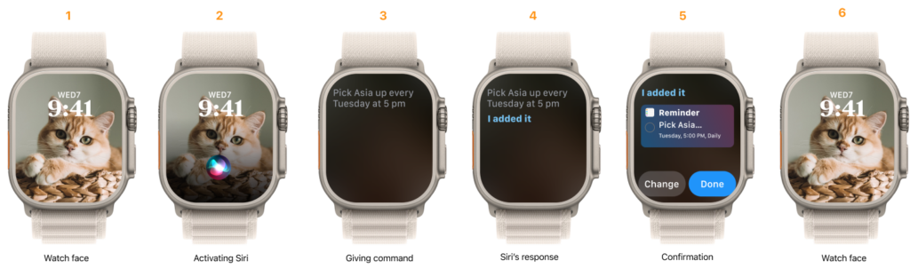
Interaction 1: Adding a note & reminder
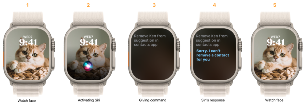
Interaction 2: Remove a contact from the suggestion list
Prototype 1:Adding a note & reminder (Click to start)
Prototype 2: Remove a contact from the suggestion list (Click to start)
7. Failure Analysis
Because it was a solo project, I had to investigate and solve the problem myself. Therefore, I encountered many obstacles and also learned many valuable experiences from the failures in the design process.
The way we construct interview questions can significantly influence users’ responses.
In a group interview, users were influenced by others when providing feedback.
Observing people doing tasks revealed even more insight than asking questions alone.
Limitations in prototyping skills and technological constraints kept users from having a smooth testing experience. Thus, yielding a nonobjective result.
I had to guide users through several steps and provided a few explanations along the way, which I didn’t consider a success.
In group critiques, I had the opportunity to learn from others, whose different perspectives and ideas sparked a lot of enlightenment and curiosity in me.
8. Business Impact
Users can now call and text people, who they often talk to, from the Contacts app. Therefore, the app becomes more useful and gains more attention from young users. In addition, Apple’s Contacts app was originally full of text and outdated, compared to other apps such as Viber, Facebook Messenger, and Instagram’s follower list. Since users found Apple’s apps more useful and appealing, Apple maintained its brand recognition and created a great user experience across its system.